Hashprice: A downward and to the right chart for Bitcoin mining

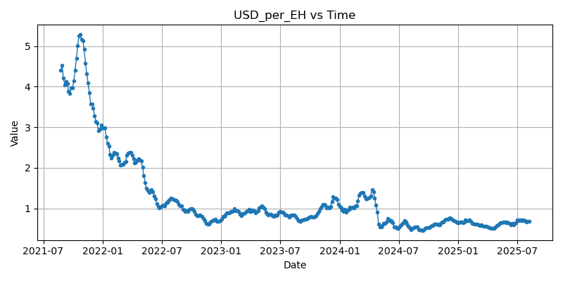
A useful statistic to keep your eye on that combines the cumulative effects of the halvings and the increase in hash rate is the miner payout per hash (this is also known a "hashprice"). "Hashprice" indicates the amount that the bitcoin network pays miners for their hash, not the amount the miners pay to obtain the hash. I'm using the obvious (obvious to me) units of USD per EH.
In the above chart we see that in the last bull market, mid to late 2021, this number spent much time above $4/EH. This year, this number has remained below $1/EH, dipping below 50¢/EH. Right now it's around 65-70¢.
This number describes the value that a miner expects to obtain when creating 1 exahash. To see how this relates to practice, consider the two units often used to describe cost of energy and efficiency of mining equipment. Energy cost is often described in USD/kWh (for example $0.13/kWh is national average) and efficiency is J/TH (the s19 is about 35J/TH).
To get the cost of producing an EH, multiply these two numbers and divide by 3.6, that is (note the 3.6 is from 3600 second in a hour, and there are 10^6 TH per EH)
cost to produce one EH = (energy cost in USD/kWh * efficiency in J/TH ) / 3.6
So for example, at current return 70¢/EH. an S19 needs to be running on energy that costs $0.072/kWh which is unavailable to most consumers.
To get the USD_per_EH value, for the latest few blocks, take the average value of fees per block, add 3.125*(latest price) to get the value of a block, and then divide by hashes to obtain a block, this will be given by difficulty * 2^{32}. (This number is the base difficulty unit, difficulty as measured is multiples of this.)
We can visualize the break-even in the following chart
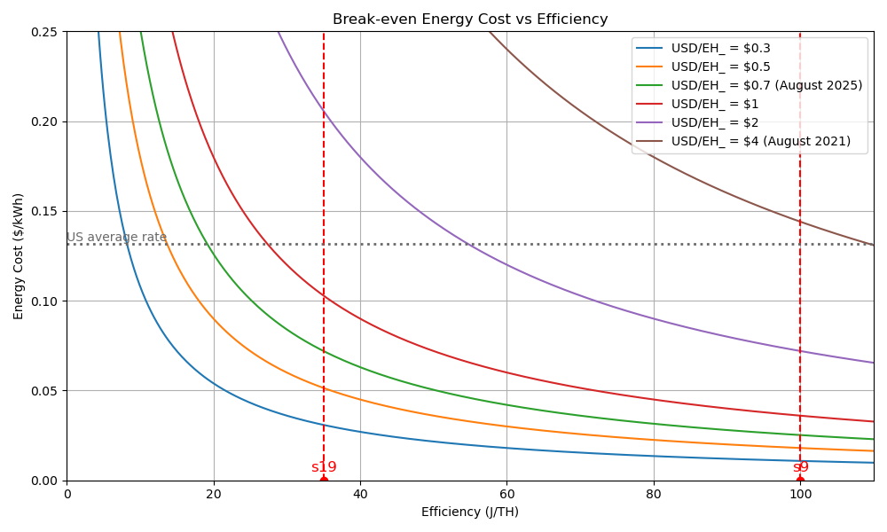
The green curve is today's break even. We see that an s19 running at the average electricity rate is not profitable (the intersection is above the green curve). The brown line is 4 years ago: Note that an s9 running at 13¢/kWh would come in below the brown curve, so would be profitable.
We can also see how pinched things will get as the hashprice continues to drop. If it drops below 50¢/EH even s19s will require energy costs of less than 5¢/kWh to remain profitable.
What does this mean ?
I think this we are headed towards massive centralization. Clearly, two things are needed to be profitable: Cheap energy and efficient chips, and both in large quantities. I don't see this as being available to all but the very specialized and perhaps connected. In theory, as Bitcoiners like to point out, there are pockets of places where energy is cheap that can be used, but if you want to do this at any scale, you have to do some set up and have access to the good machines. Sure, someone maybe be able to get some cheap sats using their bitaxe if you find some cheap energy, but to create the massive hashes going into the network, it helps to be running on the other side of the meter at scale.
An interesting thing to watch: If there are overhead costs, it is possible that corporations who are net unprofitable will continue to run mining equipment to minimize losses. For example, if the average cost to produce an EH is say, 75¢, but the operating expense of running the machines is 60¢, and the 15¢ difference is already sunk, a miner will continue to operate at any hashprice above 60¢, which will keep the hashprice from readjusting upwards.
Obligatory remarks on units from a math professor
I constructed the above chart directly from data from blockchain.info, but these charts are widely available if you google "hashprice" for example.

Often the unit is described: "Hashprice, a term coined by Luxor, refers to the expected value of 1 TH/s of hashing power per day" A wha? Bit of a weird description of a unit, IMHO. It's like describing you car's gas mileage as "expected gas consumption of 1 MPH/ of driving per day"
This is something I see a lot in discussion of mining within the industry that does not inspire confidence - many people will list efficiency as W/TH, which doesn't make sense, I guess implicitly TH is often read as TH/s, but I get the feeling the most people don't know this, - if they did they would just write the correct units, J/TH and skip faking the dummy time unit. My guess is there is an inability or unwillingness to break down the units. Also I'm an old math professor.
How I got and graphed the data
Just because I like to show my work:
Data is from Blockchain.info
https://api.blockchain.info/charts/difficulty?timespan=all&format=csv
https://api.blockchain.info/charts/miners-revenue?timespan=all&format=csv
Generating a simple dataframe
import pandas as pd


df_dif = pd.read_csv("difficulty.csv")[-1200:].reset_index(drop=True)
df_mr = pd.read_csv("miners-revenue.csv")[-1200:].reset_index(drop=True)

df = df_dif.copy()
df.columns = ['date', 'difficulty']
df['miners_revenues_USD_per_day'] = df_mr.iloc[:, 1]
df['miners_revenue_per_ten_minutes']=df['miners_revenues_USD_per_day']/144  #proxy for revenue per block
df['total_hashes_per_block'] = df['difficulty']*2**32
df['USD_per_hash']= df['miners_revenue_per_ten_minutes']/df['total_hashes_per_block']
df['USD_per_EH'] = df['USD_per_hash']*10**18
(Note that I'm just taking the most recent 1200 entries, the data is broken into 4 day chunks, so this goes far enough back. The revenue and difficulty are offset by two days, so I'm just fudging a two day shift, which doesn't alter the trend.)
Then I smooth it slightly and plot
import matplotlib.pyplot as plt

df["date1"] = pd.to_datetime(df["date"])

df = df.set_index("date1")
df["smooth"] = df['USD_per_EH'].rolling(window=5, center=True).mean()
# Plot

years = 4

df0 = df[-91*years:]

plt.figure(figsize=(8,4))
plt.plot(df0.index, df0['smooth'], marker="o", linestyle="-", markersize=3, linewidth=1)

plt.title("USD_per_EH vs Time")
plt.xlabel("Date")
plt.ylabel("Value")
plt.grid(True)
plt.tight_layout()
plt.show()
For the second graph
import matplotlib.pyplot as plt
import numpy as np

# Define efficiency range from 1 to 110 J/TH
efficiency = np.linspace(1, 110, 550)

# Define product price levels in $/TH
value_levels = [0.3, 0.50, 0.70, 1, 2, 4]

# Create the plot
plt.figure(figsize=(10, 6))

# Plot each curve for different price levels
for value in value_levels:
    break_even_energy = 3.6 * value / efficiency
    label = f'USD/EH_ = ${value}'
    if value == 0.7:
        label += ' (August 2025)'
    if value == 4:
        label += ' (August 2021)'
    plt.plot(efficiency, break_even_energy, label=label)

# Add vertical dashed red line at x = 35 with marker and label 's19'
plt.axvline(x=35, color='red', linestyle='--')
plt.plot(35, 0, 'ro')  # red marker at bottom
plt.text(35, 0.005, 's19', color='red', fontsize=12, ha='center')

# Add vertical dashed red line at x = 100 with marker and label 's9'
plt.axvline(x=100, color='red', linestyle='--')
plt.plot(100, 0, 'ro')  # red marker at bottom
plt.text(100, 0.005, 's9', color='red', fontsize=12, ha='center')

plt.axhline(y=0.1317, color='dimgray', linestyle=':', linewidth=2)
plt.text(0, 0.1317, 'US average rate', color='dimgray', fontsize=10, va='bottom', ha='left')


# Customize the plot
plt.title('Break-even Energy Cost vs Efficiency')
plt.xlabel('Efficiency (J/TH)')
plt.ylabel('Energy Cost ($/kWh)')
plt.grid(True)
plt.legend()
plt.xlim(0, 110)
plt.ylim(0, 0.25)

# Show the plot
plt.tight_layout()
plt.show()
This was a collaboration between copilot and myself, I usually am too lazy to add comments.